My Planner Pages – too many weekly pages!
Hey friends,
Are you overwhelmed with weekly pages? Too many options but not sure what you would like to use or will help you be productive? I feel you, the ones I have created I have created at the behest of friends who said “I want X” on the page. Then I just uploaded as well. Let’s go over what they wanted and what I had.
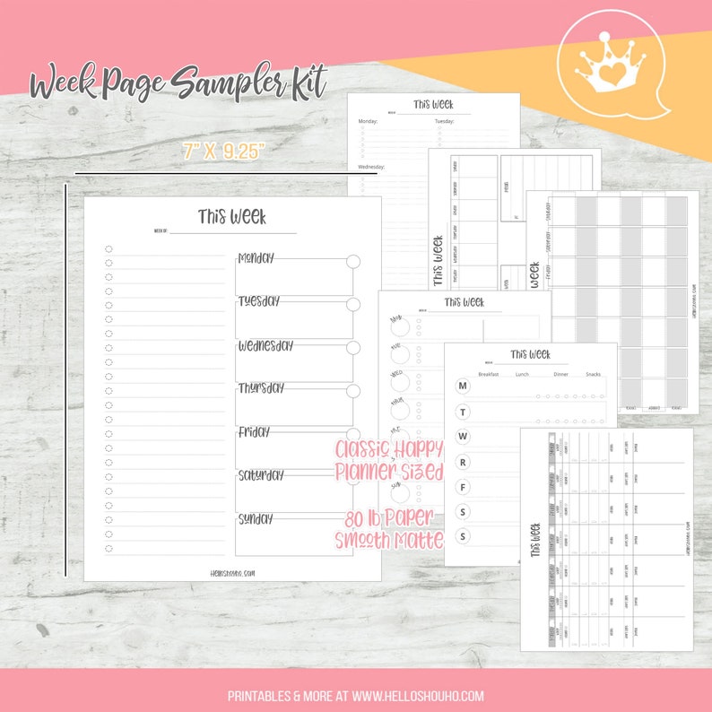
First off, I have a week on one-page samples:
If you are unsure on what you want to try. I do this with all the pages, so you can try multiple styles of planning. I also always suggest writing it down first, doodle it on a piece of paper, snatch a screenshot if your techy and TRY it out first. Everyone is different, have specific daily needs and their brain might work differently. This is how my (and friend’s) work.
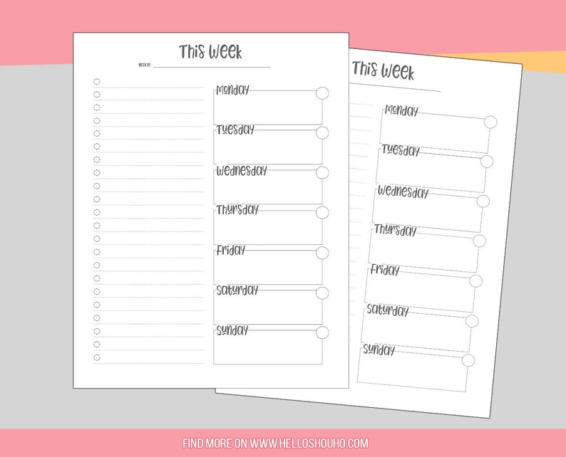
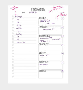
First up, my favorite week and the one I use all the time. I don’t even snap that many pics of it for Instagram anymore as I just use this constantly, with very little change. I love using florals on the side to decorate this baby and it’s just the most productive spread for me.
I have a spot for timed events, a note on the week at the top, and a master task list. I like this method because I don’t really like to assign a task to each day and am more of an “I feel like doing X today” or “This needs to get done before Tuesday, so I’ll do it now” type of person. I like to this of this list as, if I get most of this done this week, I will call it a success. I use this mental prep to allow myself to mess up – as I can be mean to myself and it helps me manage my mentality and expectations.
I love this spread. It’s perfect for me. I have a tweak I am going to try out soon, adding habits, but haven’t yet.
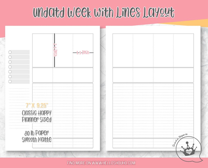
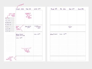
This next spread is a pretty basic vertical with lines. I made this also for me, for weeks I have more going on. I recently decided I liked the blank version (I’ll have to add it later, I have so many spreads @_@; but the blank one allows for more decorating). I loved the vertical idea but I needed lines. So I added lines. I have a shift work calendar on the side, to track your hours or master task if you prefer, and then I broke up the boxes into the top for all the decor, middle for events, lines for task and notes, and bottom for habits – meals – or notes.
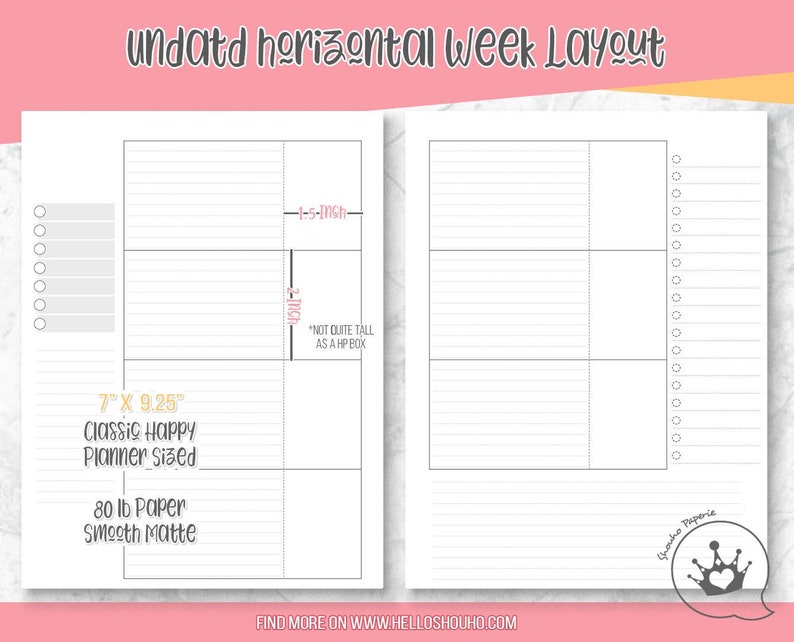
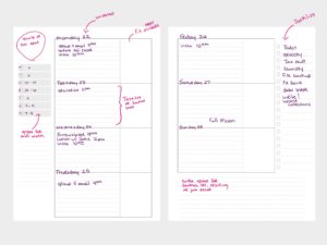
This one is a horizontal version – same details. Sidebar for schedule, lines and journal spots, and a master task list. Keep in mind, if you like one without something, you can always add in a half-page to use as a master task list (if that is your thing).
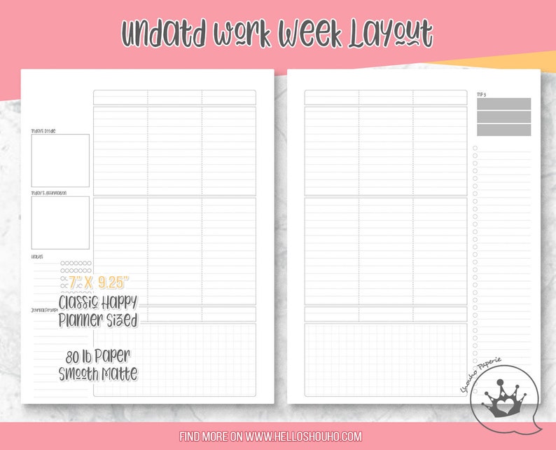
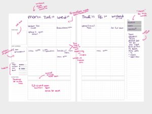
This next one is special as it’s really customized – this is something a friend wanted. She wanted space to do all the things in one spread. It has fewer days combining weekends (not my preferred method) since this is more for a workweek. I am not a doodler, surprisingly, so I hardly ever use doodle spaces. I am very much a list person or text-based so this is more for you if you are a visual person.
I have more than this….but it’s a start on breaking them down! I wanted to go over my choices and how I use (or designed them to be used) them so you can be better educated on what might work for you. Always feel free to message me for a customization or custom print! I am so passionate about the paper quality and prints, so you will get a great insert even if it’s not mine!
Thanks!
