Google Sheets – habit tracker + charts, tips and visuals
Hey Friends,
I have a new habit tracker, plus a ton of tricks to share. I decided to go back to digital this year to track things with stats. I can see it at a glance, and do the math and formulas so I can see immediately. Some quick links:
This is the OLD one, if you want a simple one.
And my favorite emoji site: https://fsymbols.com/emoji/ to add fun color markers.
Now, the new one.
You can view it here, I don’t want to hear judgement on my stats, and you will need to copy it to use it on your own drive. Seriously, I know my issues. Mind yours.
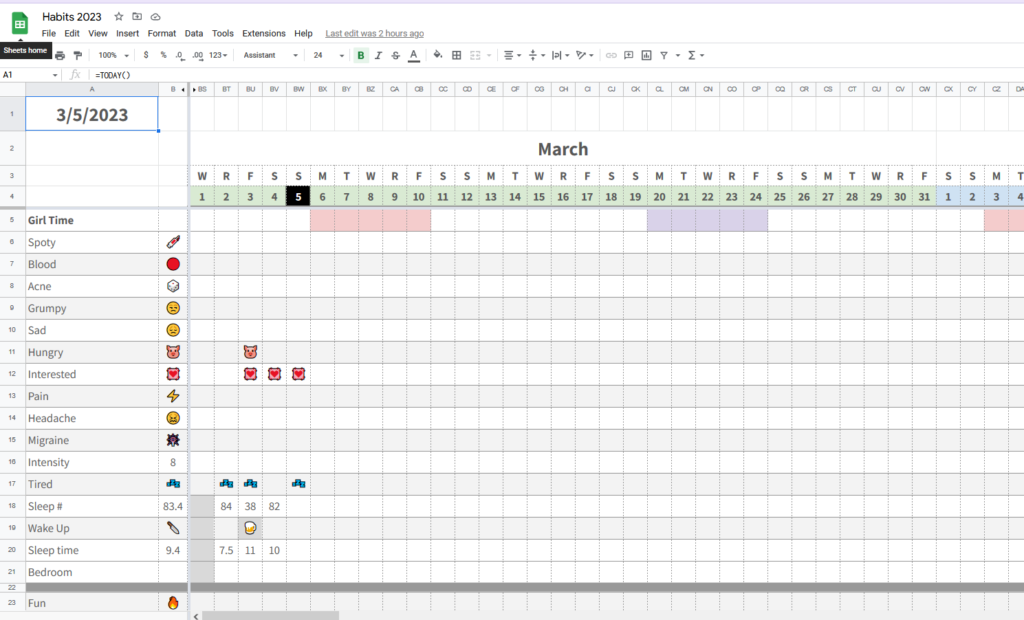
Now then, on page one is my current yearly one all together. Feel free to delete, do monthlys, etc whatever on your own. I decided to combine mine for ease.
Some handy formulas in this page,
Get today’s date, updates automatically: =TODAY()
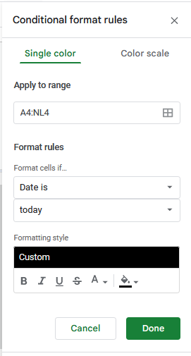
I also setup a conditional formatting to black out the date for today, so I can easily find the correct columns. Here are those settings:
Page two, is the calculator for me, month by month, so I can see the stats I want to at a glance.
The formula’s I am using here are mostly to count the emoji’s in each cell, and an average for the numbered ones.
=counta(RANGE) & =AVERAGE()
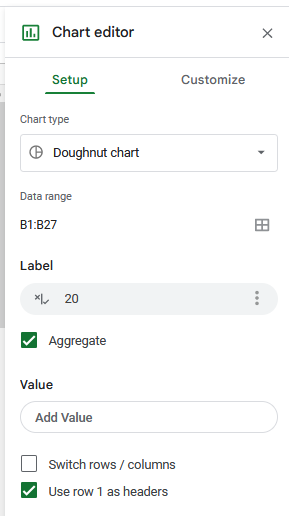
Now, page three is where all the fun things are so you can really customize your own. You might have seen trackers that are build to update with status, and bars, and even a graph or image. These are all formulas in sheets.
So how I built this so you could copy it, on the A ‘items’ are your habits, then you click the dot and it updates automatically at the top. If you click boxes, it will update the chart as more are complete. This is the =COUNTA(RANGE) formula again. It purely counts if a cell is empty or not. Since the cells all have a checkbox, it is counting a total of 20 of them.
Then to get the percentage, you use: =COUNTIF() this will count ones that are checked, so 10 out of 20 or 10/20 = 50%. Simply divide the cell by the cell and make it’s format a percentage.
The donut chart, is a chart with these settings, you can use whichever colors you want here. Then you will need to customize the colors, one for true one for false. I also have it IN the cell, not above anything so it will be constrained to that cell.
The other chart I have here is a sparkline chart, they have a few times, to get this one:
=SPARKLINE(B2,{“charttype”,”column”;”color”, “purple”; “ymin”,0; “ymax”,20})
This one is referencing the row I named count checks, it needs to reference a cell so you will need a total somewhere, but you can always hide it. Then it’s a column type and I picked purple as the color. Ymin is the minimal number you start with – so 0, then max is out of – 20 again. If I had 30 task, I’d use 30 instead.
Here is Google’s sparkline notes.
The other formula I have saved in here is a random generator, if you want to use it. I saved it so I had it just in case:
CHOOSE(RANDBETWEEN(1,5),”London”,”Berlin”,”Rome”,”Madrid”,”Lisbon”)
It just seemed fun for maybe TBR’s etc.
Feel free to ask me any questions. As a reminder, you need to copy the sheet I shared to your own drive to be able to edit it. Happy goal tracking